U.S. Department of Labor
RWD & IA Case Study
The Department of Labor is a U.S. government agency with a mission “to foster, promote, and develop the welfare of the wage earners, job seekers, and retirees of the United States; improve working conditions; advance opportunities for profitable employment; and assure work-related benefits and rights.”
Project Overview
In the UC Irvine UXUI Bootcamp, I was prompted to redesign a government agency website of choice. The goal was to execute a responsive web design (RWD) to enable consistency and ease of use on both desktop and mobile, specifically for primary and secondary navigation. I chose the U.S. Department of Labor as it had the most potential for improvement at first glance.
Problem
Current website has a confusing and overwhelming navigation and inconsistent UI elements throughout desktop and mobile, leaving the user lost and confused.
Solution
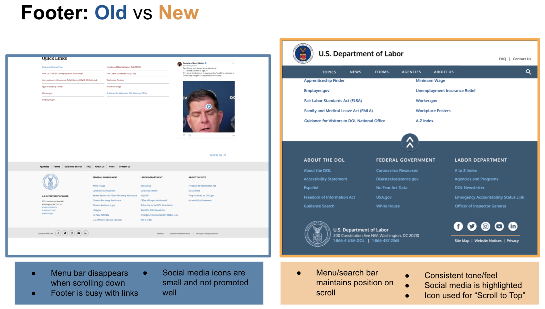
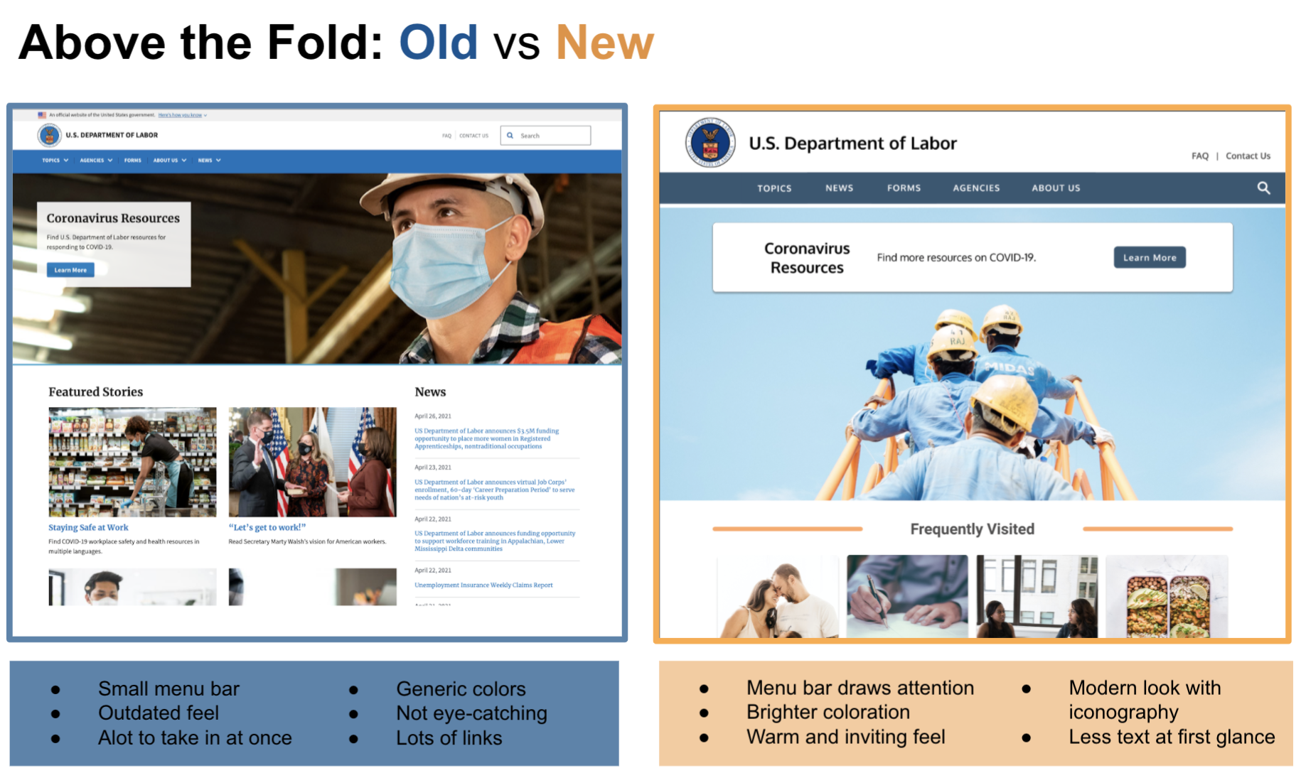
Focus on improving the primary and secondary navigation by introducing content hierarchy and clearly categorized topics for more intuitive navigation.
Details
Role
UX and UI Designer (Individual Project)
Timeline
4 Weeks
Tools
Figma, Miro, Invision, Zoom
My Design Process
Understanding the User
Step 1: Build a Proto Persona
This was my first step to get an understanding of who a typical user of the DOL could be
Meet Betty, a working professional expecting her first baby
She is curious about rules surrounding maternity leave
Step 2: Why is the User on dol.gov?
Betty recently found out that she is expecting a baby
Her workplace has limited information on the maternity/paid leave process
To find more information on this, she goes to the Department of Labor website
Step 3: Analyze the Typical User Path
As a designer I find it important to really get to know the existing site, so I step into the shoes of a potential user and navigate through while taking notes along the way. These notes will come in handy when coming up with a usability testing plan
Understanding the Current Interface
Original Site: Redline Annotations
Through the eyes of Betty, I navigated throughout to get an idea of what we are working with.
It was clear to see that the navigation was a bit overwhelming at first glance.
Top Navigation is definitely a valuable element for users as they navigate throughout the website, so I knew it was something to revisit during Guerrilla Testing
Empathizing with the User
User Research
After analyzing the website and typical user path of the DOL, a user testing plan was created collaboratively, with two other designers (due to the sprint timeline, we were asked to combine forces for interviews and user tests).
The objective of testing was to study the users thoughts while navigating the site.
6 users were asked to complete 3 tasks:
Find out what is the legal time period for maternity leave.
Find out what is the minimum wage in CA
Follow the DOL on Instagram
Affinity Diagram
We then jotted down notes from each user interview, grouped them together, and categorized each section to gain a better understanding of our users.
Heuristic Evaluation
Key Takeaways (Post-Testing)
Main Navigation > Topics
Focus of the redesign
“Topics” text is clickable, but not apparent in current design
During the first round of usability testing, “Topics” was the most visited tab and the highest pain point due to the lack of categorization
General
Current typography lacks a hierarchy
Users found the font too small throughout the navigation
Main navigation bar can be better spaced out
Determining the Problem and Scope
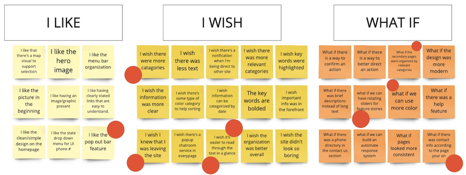
I Like, I Wish, What If
This is the I Like, I Wish, What If method, which maps out user thoughts and desires. The red dots indicate each designer’s opinions on what they find most important to tackle in the redesign. Based on the votes, we collectively decide on what features to prioritize.
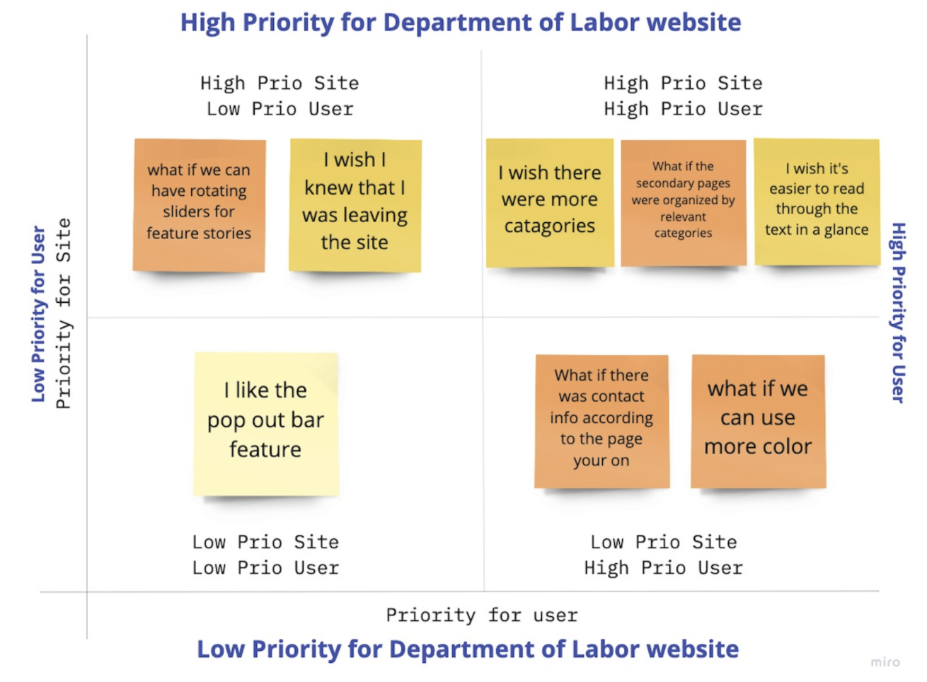
Feature Prioritization Matrix
We then separated the main notes into a feature prioritization matrix, which helped us evaluate what is a high priority for both the user and the Department of Labor. Anything in the high-high quadrant would be our first course of action in the redesign process.
This is a great tool to determine a scope that is feasible within the design sprint and one that is impactful for both the user and stakeholder.
Information Architecture
Card Sorting & Site Mapping
I did a virtual card sorting with 90+ cards that captured the labels from the main navigation, sub navigation and footer.
I do this to see what categories are intuitively made when shuffled and sorted. This resulted in a new and improved Site Map.
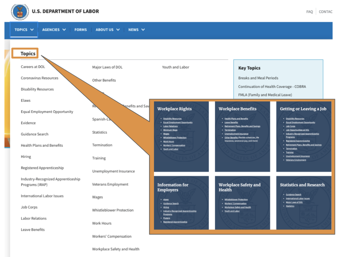
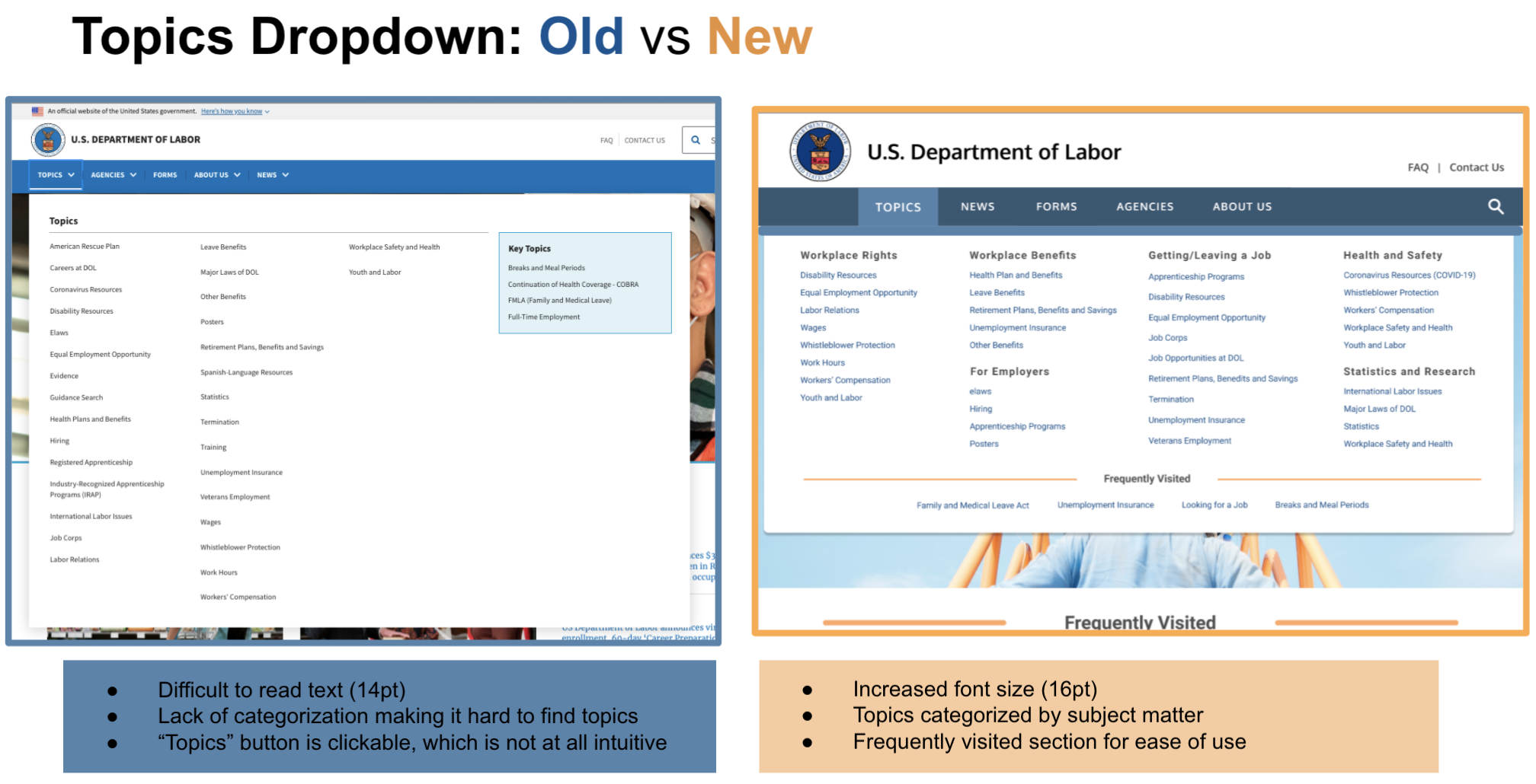
A Closer Look at the Topics Menu
Hidden categorization in the bolded Topics text
Lack of categories is the drop down menu displayed
Ordered alphabetically
Clear categorization
Digestible information for the user
Mainly categorized by usefulness and alphabetically
Lo-fi Prototyping
Lo-fi usability tests were conducted and the most common user call out was about hover click-ability issues
UI Style
From Mundane to Modern
Using user insight, a mood board, color accessibility checker, and my coffee maker, I developed this style guide for my redesign.
My main goal was to create a more warm and welcoming feel through clean, mellow blues and modern and comforting tones of orange.
*Note: I updated the main CTA button colors from orange to blue because the initial color that I chose did not pass the accessibility test
Responsive Web Design
Shoutout to Grids!
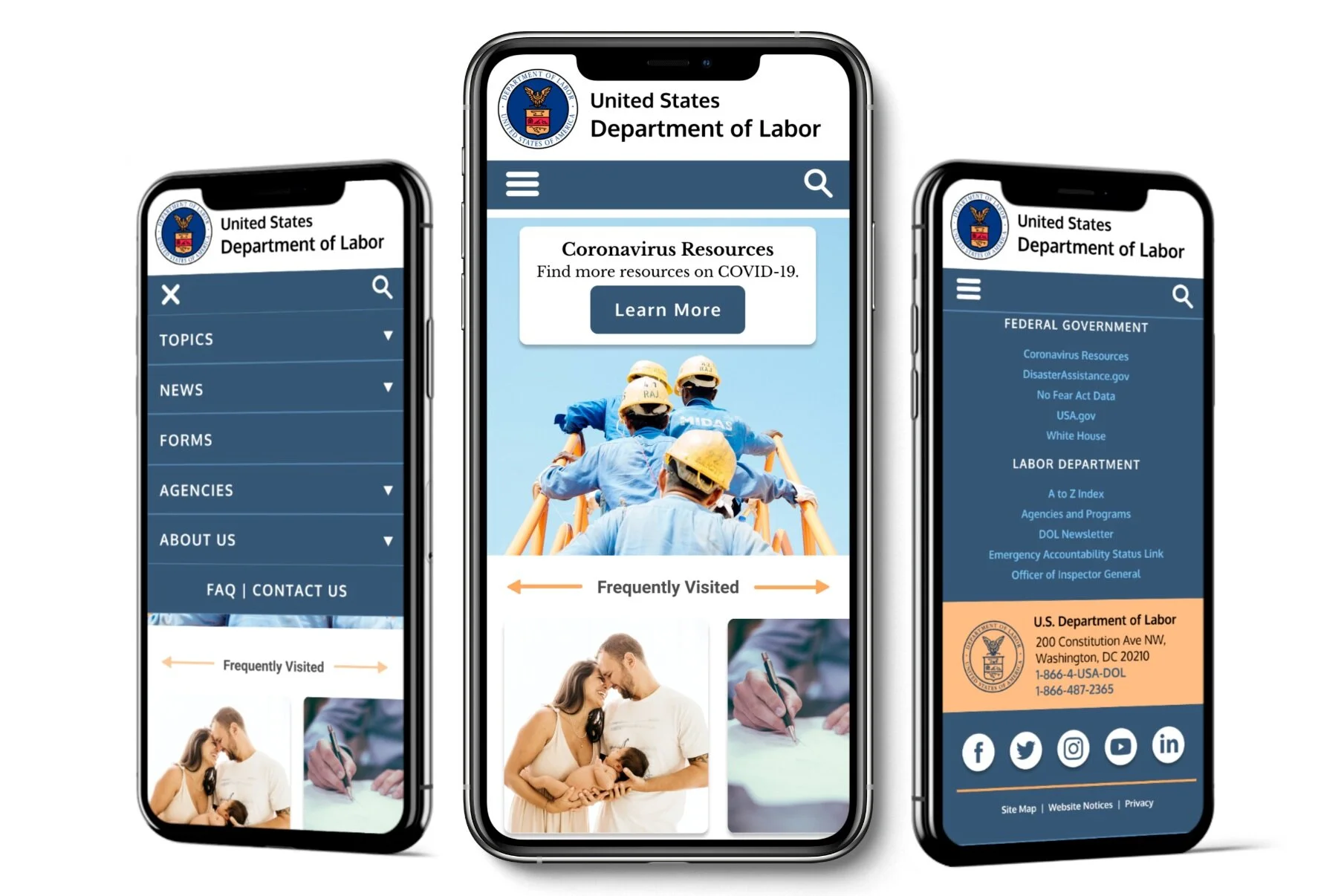
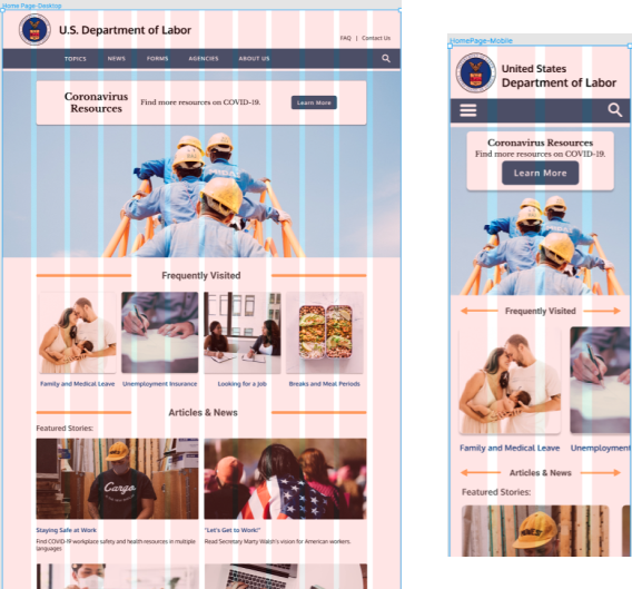
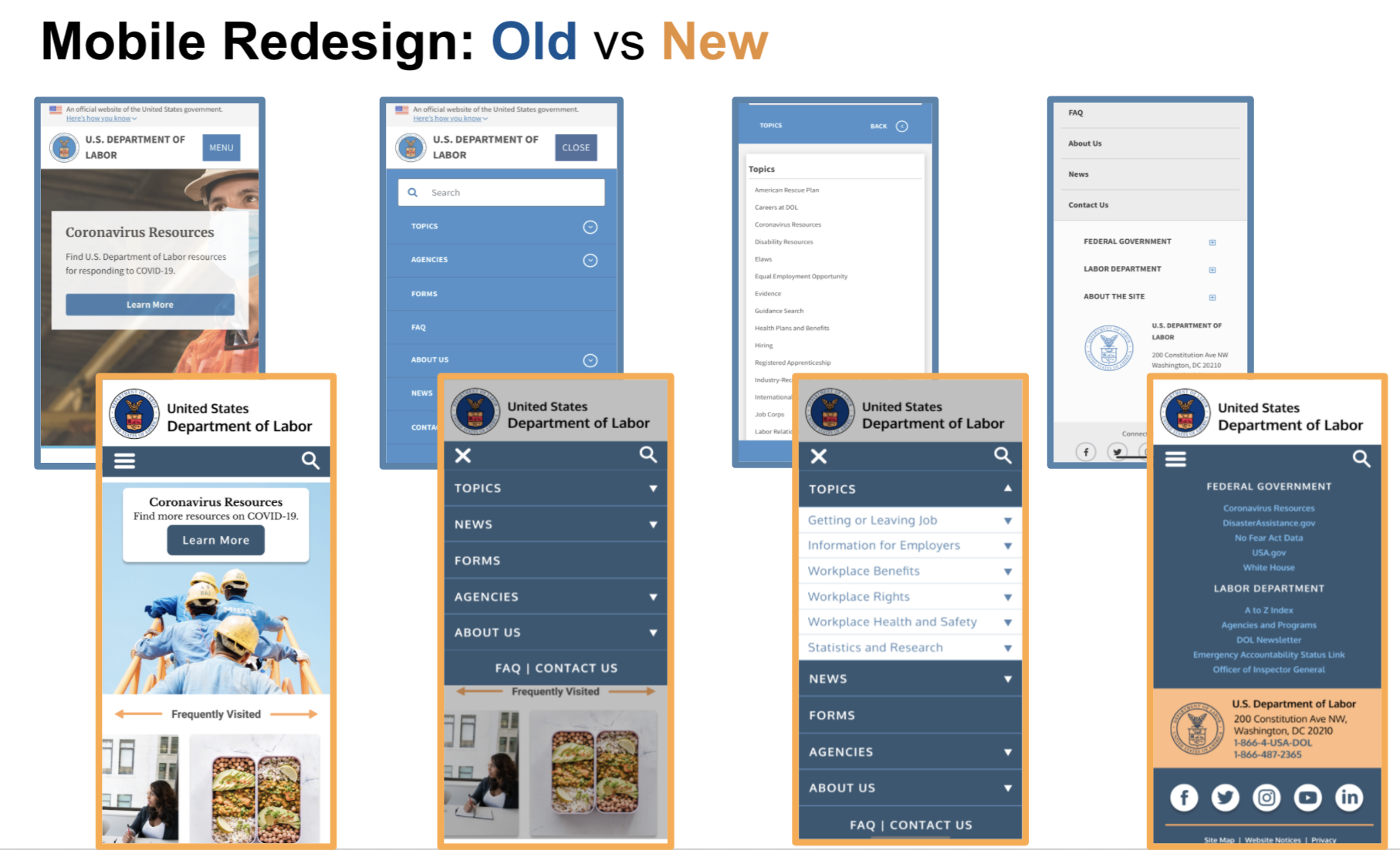
To best create a consistent, responsive design transition between desktop and mobile version with ease, I utilized the layout grid feature.
Desktop
- Macbook Pro
- 1440x900 pixels
- 12 column grid
Mobile
- iPhone 11 Pro
- 375x812 pixels
- 4 column grid
Usability Testing
Mid/Hi-fidelity User Testing
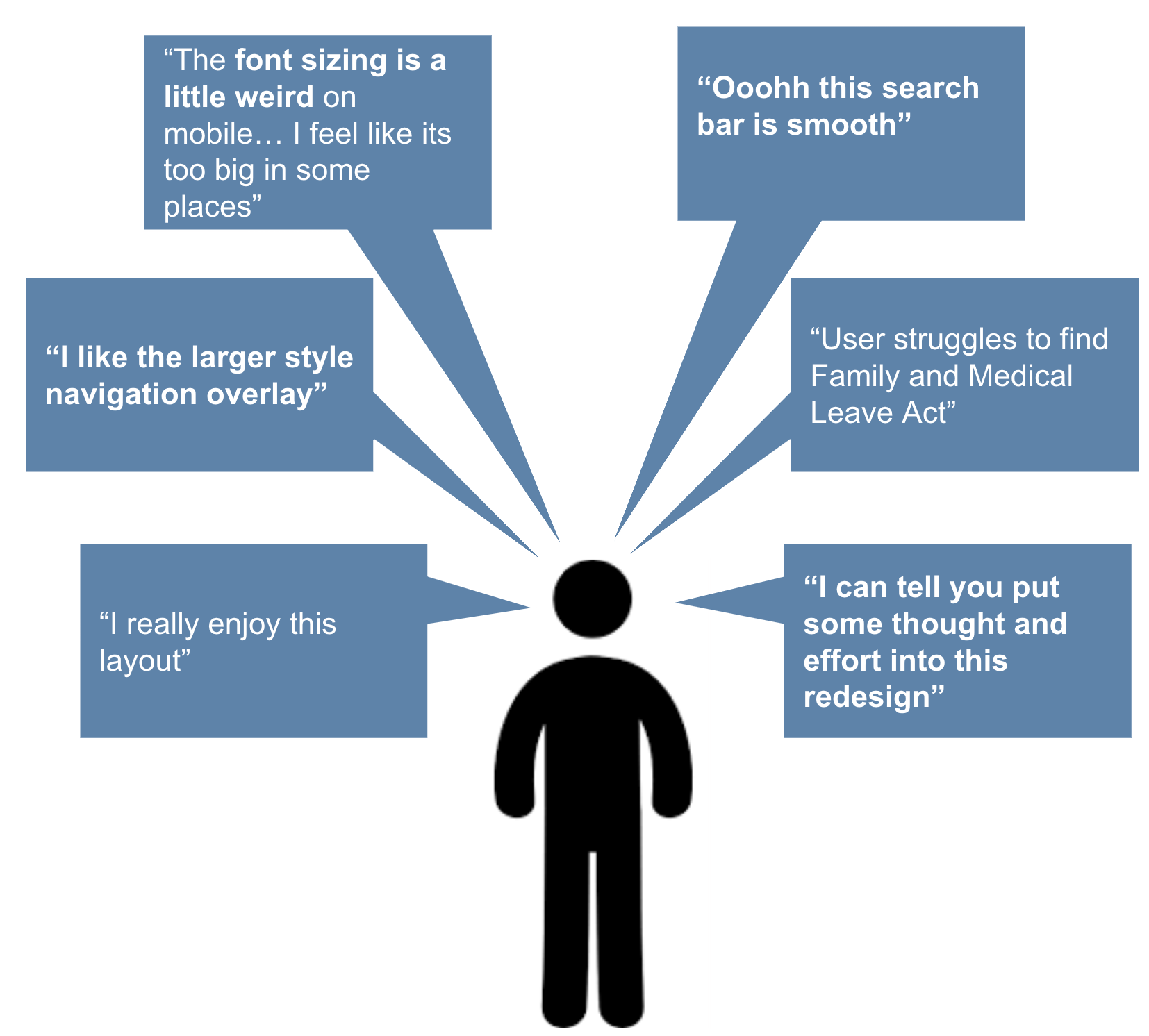
To assess my lo-fi iterations and UI design decisions, I conducted 5 more usability tests with the High Fidelity Prototype.
Users were asked to think out loud as they complete the following tasks:
Find the DOL’s social media
Find the Family and Medical Leave Act
Go to the News section and look for more news
Where would you go to learn more about the DOL?
Find the address and phone # of the DOL
Peer Feedback
Peer Feedback celebrated the successes of the redesign and also gave me some great insight on where to improve. My most common section for feedback was need for simple clean up, topics menu improvement, and revisiting the news section layout. So that is exactly what I did!
Iterations
Topics Dropdown
During usability testing and peer feedback, the user shared that they wish there was a way to see the frequently visited items on the dropdown itself. So, I incorporated it into a new dropdown design as you can see here
News
A user asked: “is featured stories and news the same thing?”
It in fact is not the same thing but the confusion is completely understandable, so I chose to combine the two sections and give it a new title: Articles and News.
Now, the user has one place to go if they are seeking current information!
Animations
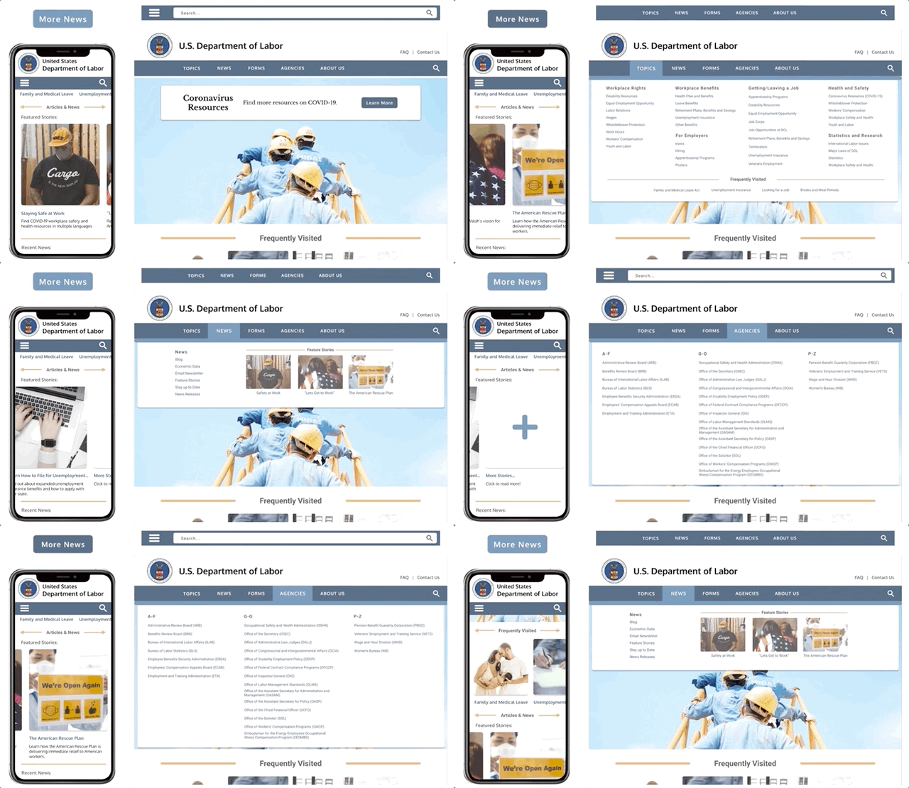
Interactive elements have proved to increase user experience! So I wanted to make sure to add some to allow the user to have some more control and guidance as they navigate the website. Their decision to click a button is confirmed through the UI of a clear hover state. Their decision to scroll through the frequently visited site is rewarded with a delightful scrolling experience.
Before and After - Scroll Through
Final Prototype
Next Steps
Build out secondary pages on top navigation
Reach out to the U.S. Department of Labor to get stakeholder insight
Measure Key Performance Indicators on user navigation
Continue testing and iterating along the way!
While you’re here…
-

Website Redesign
-

Mobile App Design

