MYtinerary
Mobile App Case Study
MYtinerary is a conceptual travel application, designed to make the process of planning a personalized itinerary stress free!
Project Overview
In the UC Irvine UX/UI Bootcamp, I was prompted to create an app for a new, hypothetical, travel startup. The startup plans to launch the app once the global Pandemic ends. The startup’s goal is to build a modern-day mobile app that helps people plan their next trip, post-Pandemic
Problem
Travelers are frustrated by the overwhelming nature of finding and planning things-to-do on a trip.
Solution
MYtinerary offers a fun and easy way to build an itinerary that is customized to a travelers needs and interests.
Details
Role
UX and UI Designer (Individual Project)
Timeline
4 Weeks
Tools
Figma, Miro, Invision, Zoom
My Design Process
Understanding the User
Building a Proto Persona
This was my first step to get an understanding of who a typical user MYtinerary could be
I grew up traveling the world and have seen my dad put in countless hours researching and building the perfect itinerary for us, so I kept him in mind as I created a proto persona
Meet Tanner, a fun-loving dad that loves to travel with his family
Qualitative Data
User Interviews
5 user interviews
Approximately 25-30 minutes
Conducted & recorded through Zoom
After the Interviews
User Insights
Affinity Diagram
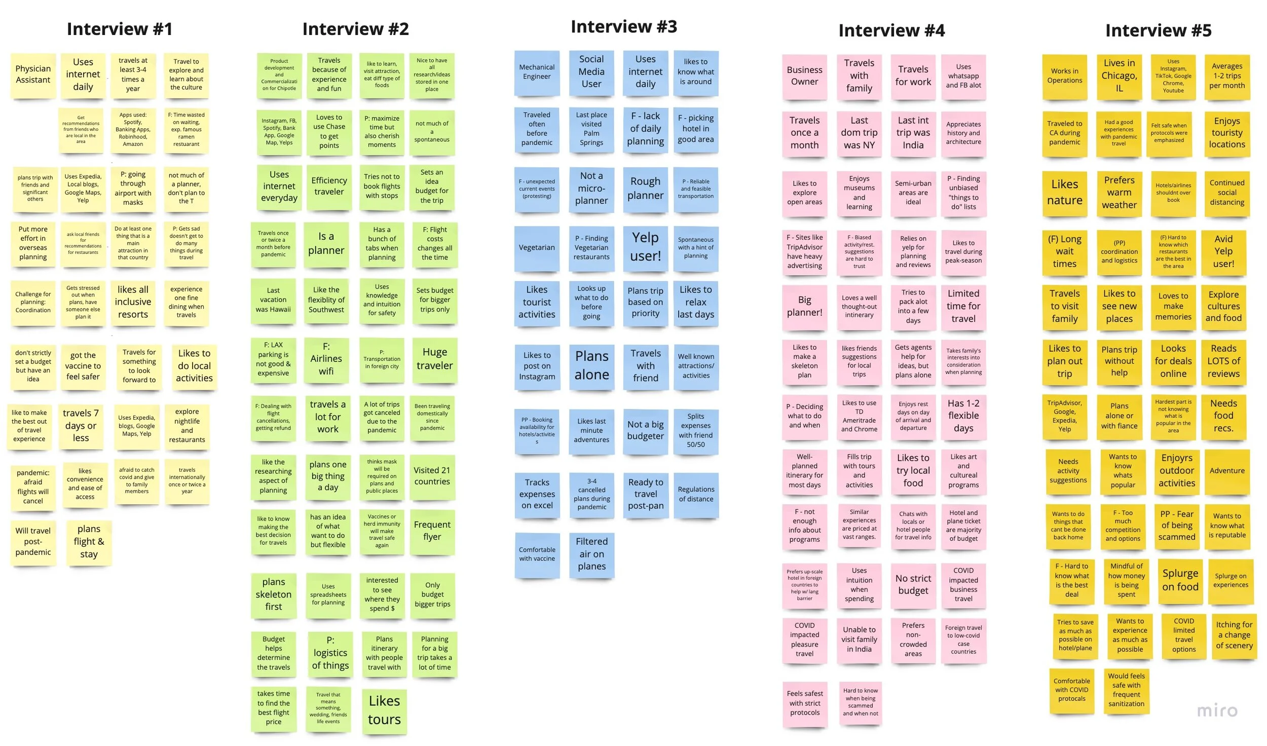
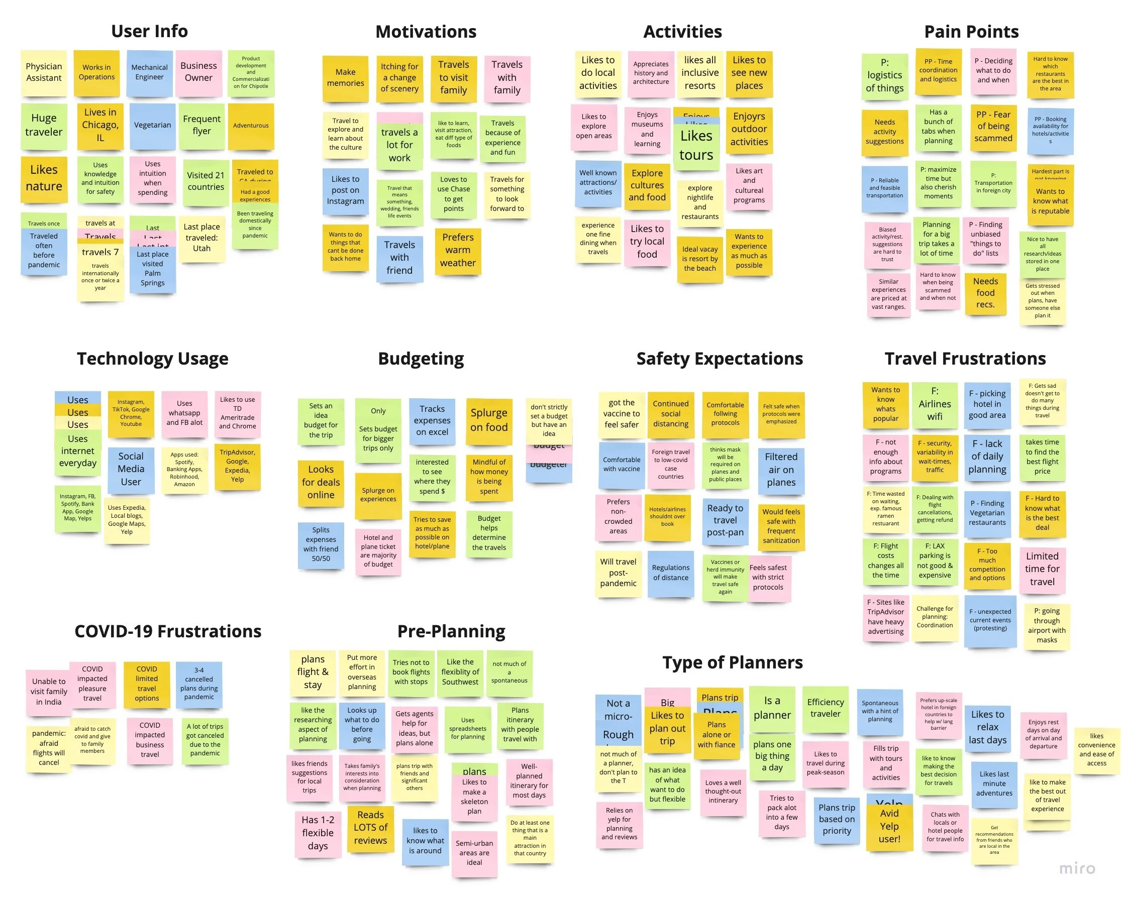
Using Miro, I wrote out the commentary for each of the five users interviewed. I then separated the sticky notes into piles using and Affinity Diagram to get a clear idea on the potential user. Through this process, I found that average user find the planning process of the traveling the most overwhelming and time consuming.
Quantitative Data
User Surveys
Out of the 51 responses we received, 88.2% of users claimed that they like to roughly plan out their trip, while maintaining flexibility. Intigrating a “rough” planning feature into the app became increasingly important.
Through surveys, I also was able to quantitatively see the need for a better planning app in the market as approximately 64% of users rated gave traveling a rating of 7 or above in terms of how overwhelming it is.
I was also able to gauge what type of activities users like filling their trip with. This data would later be used when determining the content of the app to best cater to the users interests and desires.
User Persona
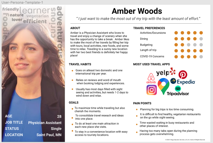
After compiling all my qualitative and quantitative data, I like to create a user persona to put a face and name to the user. This is Amber, an avid traveler that just wants to make the most out of her trip. She is the user that I will now keep in mind as I continue on to the Define phase of my process.
Identifying the Problem
User Insight Statement
A young, working professional who typically takes week long vacations, needs to feel prepared and relaxed before heading to her destination, because finding lists of things-to-do and building an itinerary during a short trip takes up too much time and leaves her overwhelmed and unfulfilled.
Problem Statement
MYtinerary was designed to help travelers conveniently and efficiently plan out their trips. We have observed that most travelers prefer to roughly plan out their trips in order to maximize their time vacationing, however the planning process is typically too overwhelming. Whether you are traveling for 3 weeks or 3 days, it is difficult to know what to do and when to do it. How might we improve the trip planning process so that travelers can have a better idea of what to do when, know what is popular in the area, and start their trip knowing they will end it feeling fulfilled?
Ideation Phase
Using user insight from interviews, I map out what the typical travel-lover likes, wishes, and envisions when it comes to the planning process of a trip. By jotting this down and categorizing based on subject, I can get a clear idea of what is most important to the user.
The red dots on the right indicate ideas and features that I found most feasible within the time period and most valuable to the user.
Value Proposition Statement
Journey Mapping
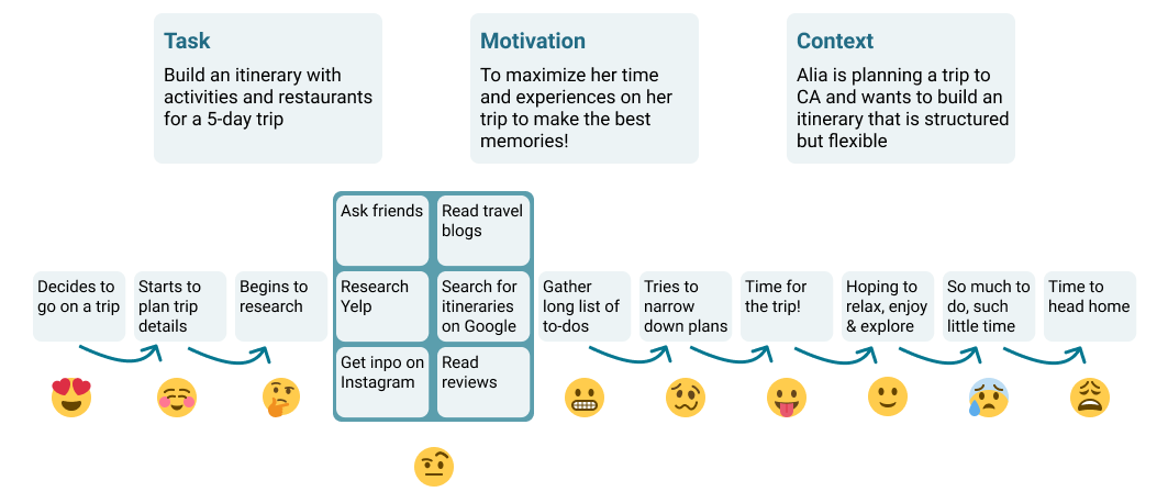
I love journey mapping to understand and track the users experience for each step of a certain flow. Here I have tracked what Aila, a make-believe persona, would be feeling throughout the traditional trip planning process. By doing this, I was able to pin point what the usual struggle is and how might I design an application to improve the experience.
Storyboarding
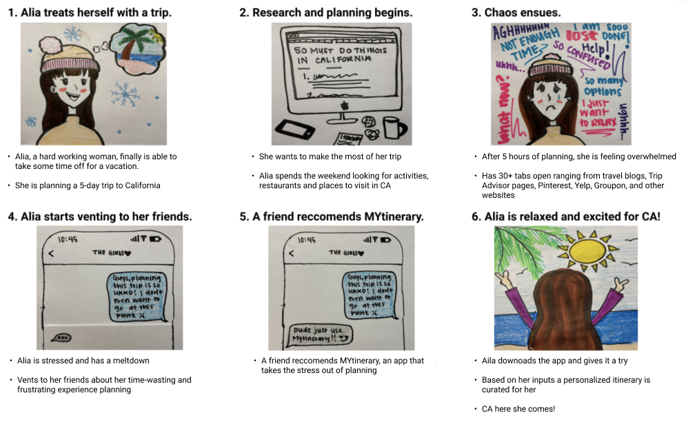
Time to channel my inner child and bring out the markers! I spent some time storyboarding to really envision what I want the user to feel through using MYtinerary. What is the struggle, what is the solution, what does the experience look like. This is a storyboard of what I imagine Alia’s experience to look like once the MYtinerary app is introduced into her life!
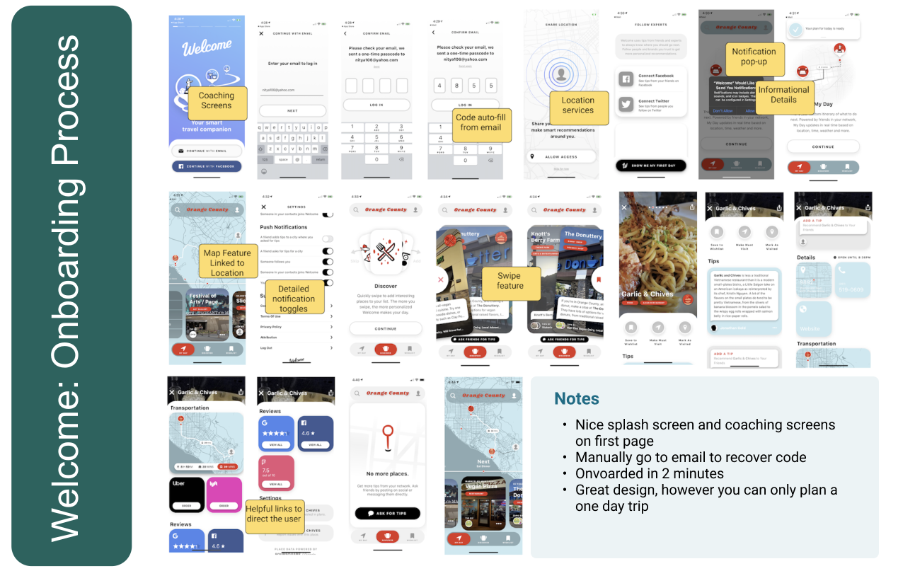
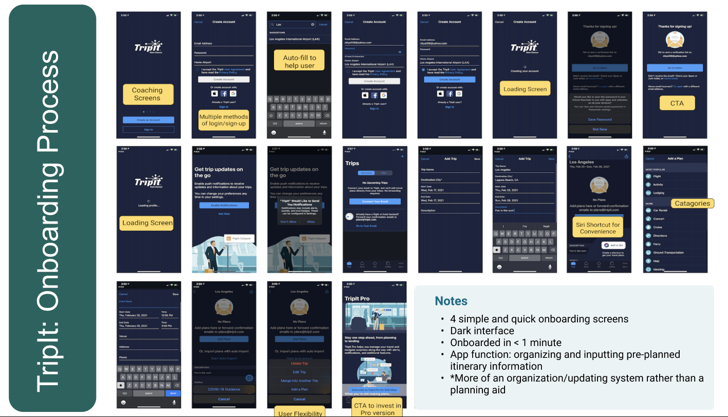
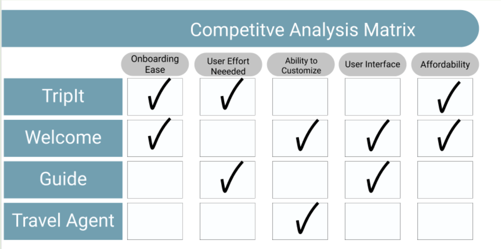
Competitor Analysis

User Flow: Onboarding
For the user flow, I mainly focused on the onboarding portion. The reason for this is that the ease of the onboarding process is responsible for a decent portion of an applications retention rate. As this was my first project and an app that I knew can be of great benefit to an aspiring traveler, I wanted to keep the process smooth and seamless.
Sketches
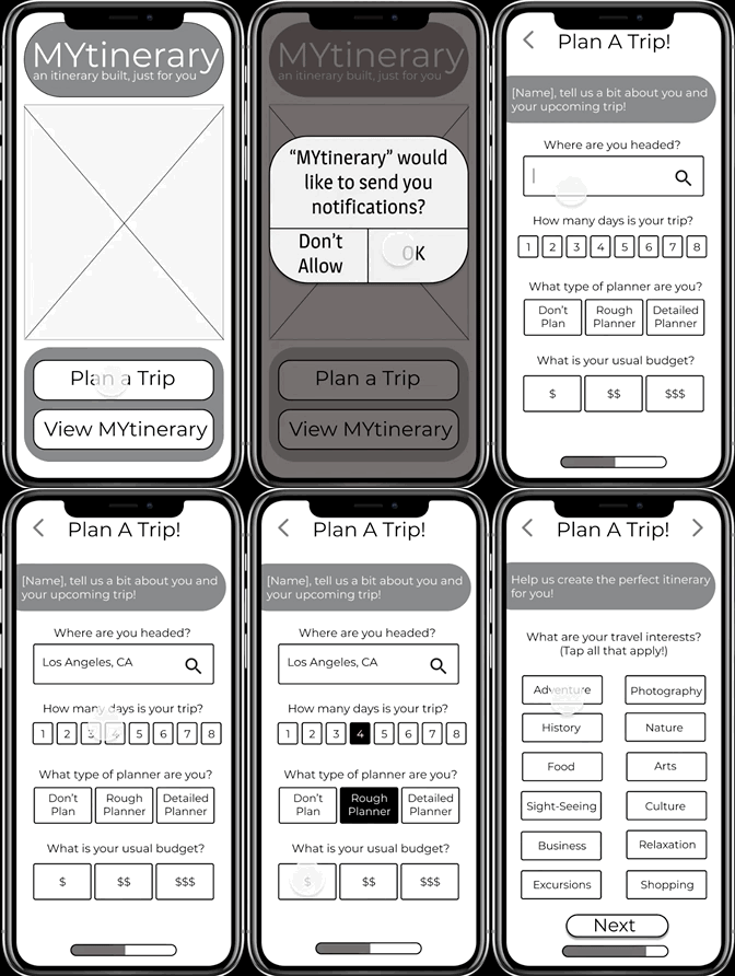
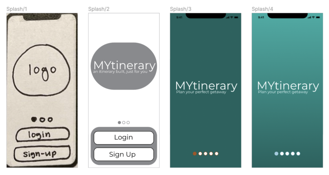
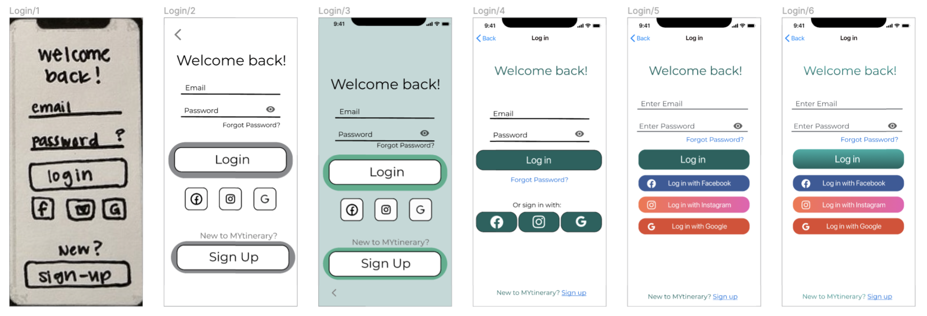
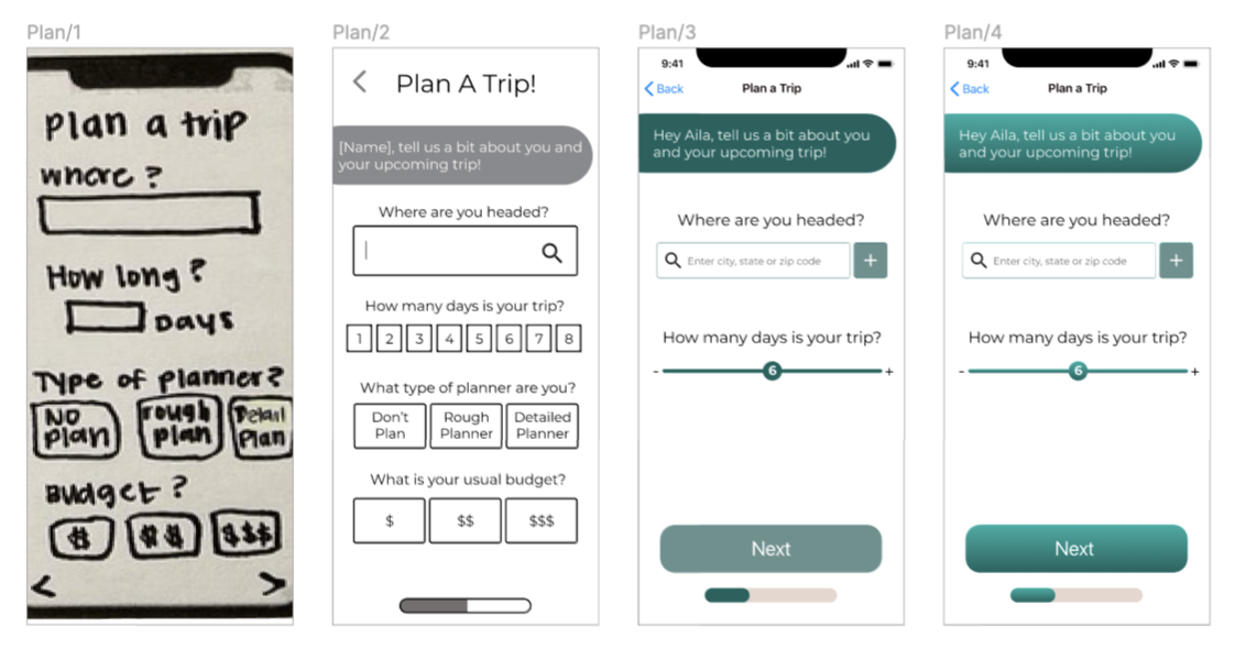
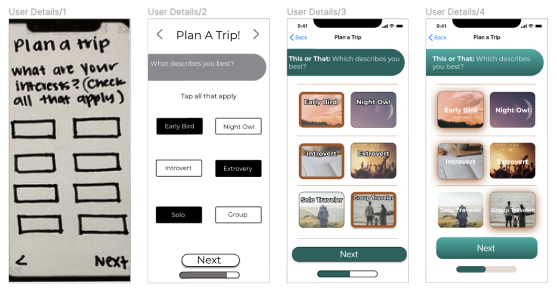
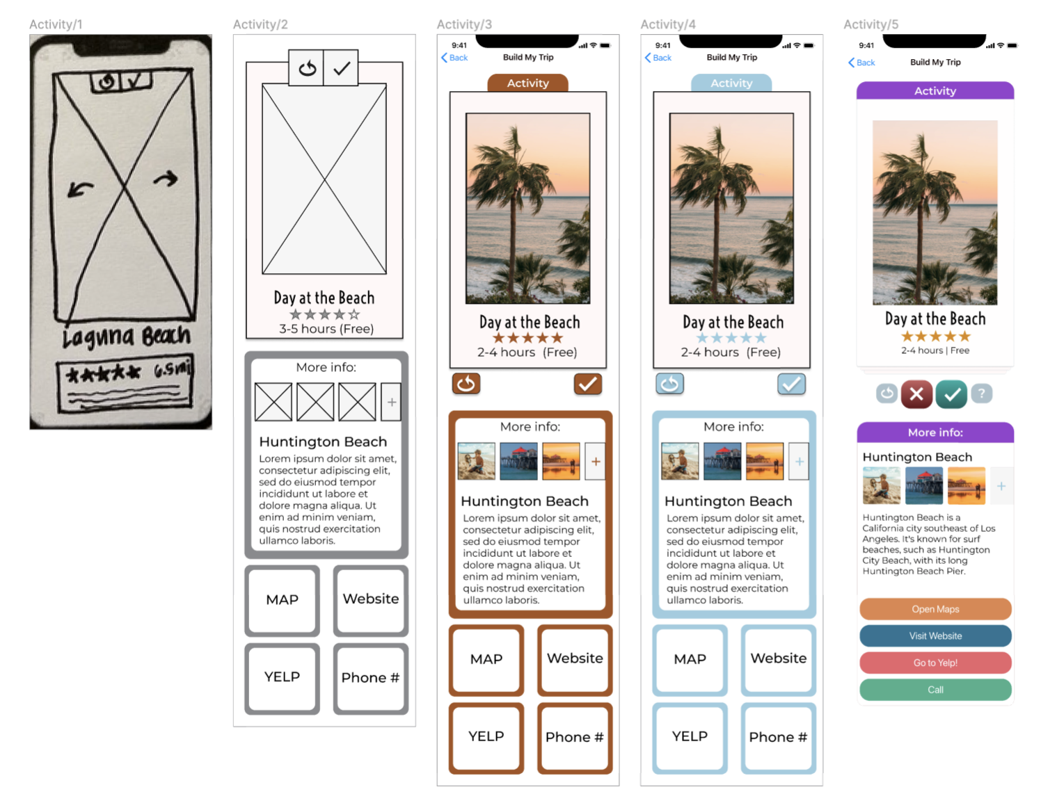
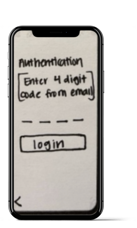
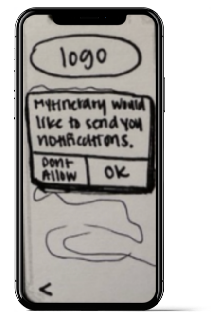
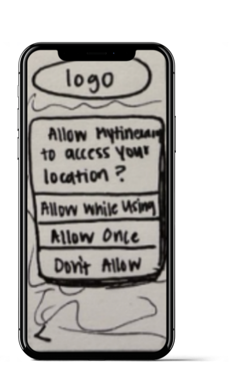
To kickstart the prototyping process, I sketched out my wireframes to follow the user flow that was previously created.
This paper-prototype helps me get a better idea of the functionality, features and design I am hoping to incorporate into the final product.

Start Here

Coaching Screen
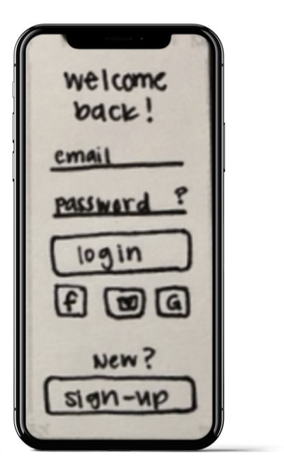
Existing User Login

Forgot Password
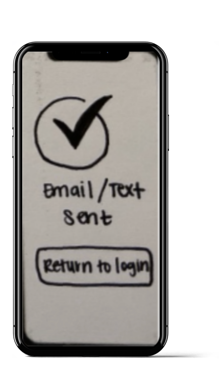
Email to Reset Pwd
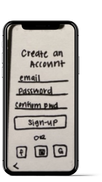
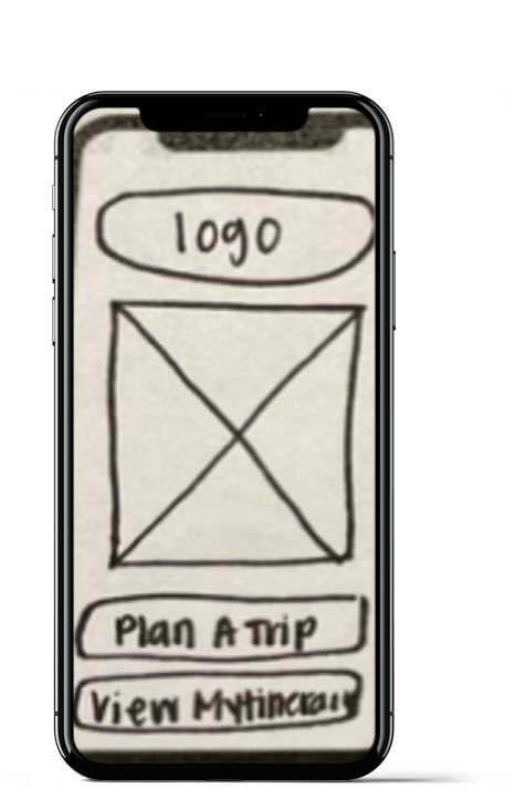
Lo-fi Prototyping & Testing
Guerrilla Testing
Objective:
To test the onboarding process
Observe the usability of the customization feature
Target Users:
Individuals who have experience with traveling
Tasks for Testing:
Create an Account/Login as user
Complete Traveler Questionnaire
Swipe through options and view MYtinerary
Analyzing the Results
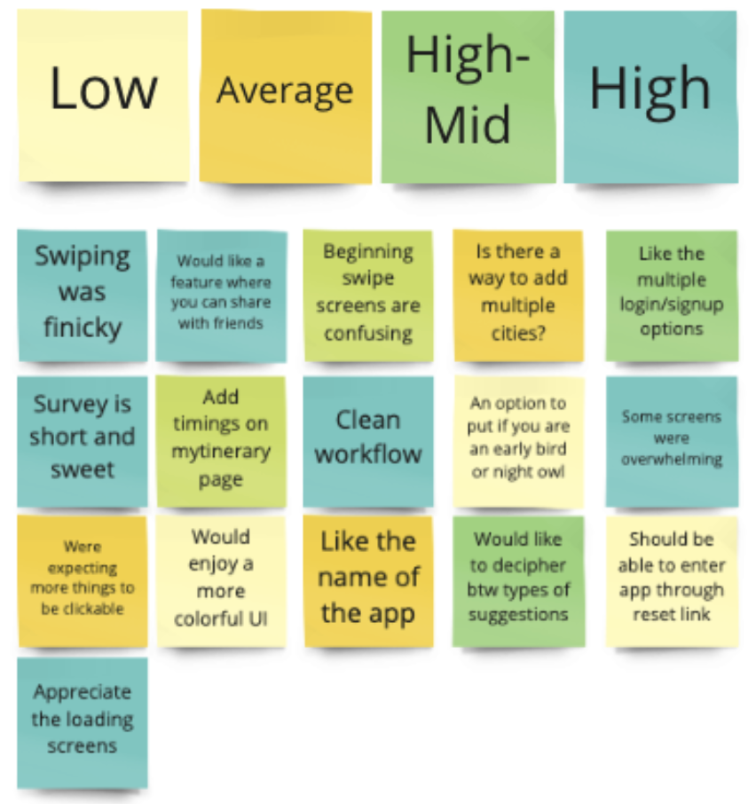
After conducting 5 Guerrilla Tests using a lo-fi digital prototype, I summarized any feedback given from each user into post-its notes on a Miro board.
By coordinating the user comments based on frequency, it was then simple to distinguish which features and functions to focus efforts on during the next mid and high fidelity prototyping phase.
Simplifying the UI
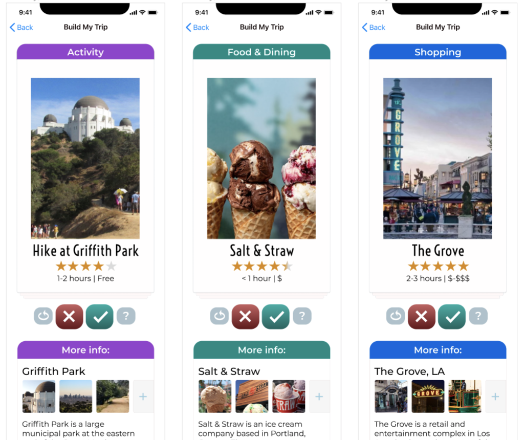
Color coded by category to provide more context to the user
Purple - Activities
Green - Food & Dining
Blue - Shopping
Adhered to UI principles to give the user more control and guidance
Red - Delete/Pass
Green - Save/Add activity
Design Evolution
Final Prototype
Figma Demo
Here is a glimpse at the High-fidelity Figma prototype for the MYtinerary Mobile Travel Application.
I found it challenging to prototype the card-swiping feature, so that is something I would like to further explore and improve.
I hope you enjoy!
(Feel free to use the contact feature to share your feedback!)
10 Major Takeaways from this Case Study
Spend less time thinking about where to start, and just start… see where it takes you
Listening to existing and potential users can completely redirect your thoughts. User research is essential!!!
A combination of qualitative and quantitative data is vital to truly understand the users needs
Giving and receiving feedback is incredibly helpful for the iteration process
Users appreciate simplistic and straight-forward design
Use of colors and consistency can evoke a certain feeling for the user.
Documenting iterations is very important!
Guerrilla Testing with lo-fi prototypes as opposed to a mid or hi-fi prototype. This will allow the user to focus on functionality, flow and features rather than colors and aesthetics
Perfection is not possible. There is always something that can be improved upon!
One can learn a lot in the matter of weeks if they lean in to the challenge
While you’re here…
-

RWD & IA Case Study
-

Website Redesign


