OC Hiking Club
Mobile & Website Redesign
The Orange County Hiking Club, is a charitable 501(c)(3) nonprofit which exists to promote physical, mental and emotional wellness through connection with nature. In addition to outdoor recreation for members, OC Hiking Club nurtures stewardship that protects trails for future generations.
Project Overview
The goal was to improve the user interface and implement a responsive web design (RWD), specifically to provide a better experience on the user side and to better communicate the organization’s mission.
Problem
Current website is outdated and cluttered. The navigation is confusing, and there are no clear call-to-actions for the user to follow. The donation flow is unappealing and doesn’t provide user control (minimum $35 donation).
Solution
Incorporate a modern feel through consistent UI elements
Simplify the the navigation to be more intuitive
Redesign the Donation flow to allow more user control and flexibility and improve the overall experience of that process (my focus)
Impact
User now feels in control and part of a community when navigating the site. There is a clear call-to-action to donate and the new flow allows for the user to customize their desired donation amount or even volunteer their time if preferred. This results in increased fund collection for the OC Hiking Club.
Details
Role
UX Researcher, UI Designer, and Information Architect
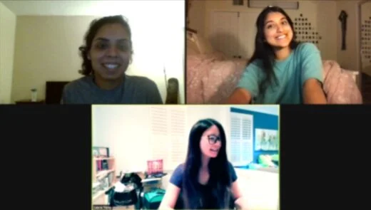
Pragti Narang (top left), Me (top right), Laura Yang (bottom center)
Timeline
3 Week Sprint (Agile)
Tools
Figma, Miro, Invision, Zoom
My Design Process
Understanding the User
Proto Persona
As UX Designers, it is important to put a face and persona to our work. We created this hypothetical character, Kelsey, to serve as our North Star.
Meet Kelsey! Our inspiration for this redesign!
She is a 33-year old teacher who just moved from San Diego to Orange County.
Hoping to connect with other “hike-minded individuals”, she finds the OC Hiking Club through Facebook, but when she visits their website, she assumes it is inactive due to the outdated look of the website.
Initiating the Research
Realization and Redirection
Our initial approach was to understand user thoughts on hiking itself through surveys and interviews, asking questions about their hiking habits and environmental values.
We quickly realized that user insight on the OC Hiking Club’s current website will be most valuable in our redesign.
Regardless, it was nice to see that so many people from around the world align with the mission to connect with nature and keep our trails clean. This brought passion to our work.
Original Site
Redlines & Heuristic Evaluation
By doing redline annotations and a heuristic evaluation about aesthetics, content, navigation, and efficiency, we were able to identify the potential shortcomings of the site’s design and became eager to see how this affects the users experience.
User Testing Plan & Guerilla Testing
This brings us to 5 minute usability testing, which we structured around the site’s 3 main focuses: Fostering community through hiking events, collecting donations/volunteers to support their mission, and serving as a resource for people to find local trails.
Three users were asked to complete the following tasks:
Join the club/attend an upcoming hike event
Make a one time donation to the org and look into volunteering
Find beginner hikes in the area
All three users shared said the site looked “bland and outdated”
The walls of text were also a common call out proving that information architecture and hierarchy was lacking
The coloration and lack of categorization left users struggling to find the information they were tasked
It was a popular consensus that the donate section was unappealing
Users were disappointed and frustrated when the only option was to give a fixed amount of $35. What if they cant afford to donate $35 OR are willing to donate $1,000 but the limit refrains them from doing so?
Competitor Analysis
A big part of the research process is to understand the market and its competitors. We wanted to get an idea of what other organizations in the nature conservation sector are doing and how they are presenting their brand online.
We were inspired by our competitors to take the OC Hiking Club in a new direction in terms of usability and interface-feel by adapting some of the following elements:
Welcoming and clean feel
Good use of white space
Simplistic, digestible design
Modern, bright colors
Clear donate button
Well organized
Determining the Problem and Scope
Affinity Diagram
Immediately after conducting a total of 6 user interviews, we jotted down notes from each conversation using Miro (each color represents a different user). After all of the notes were written out, we gathered as a team and created “piles” of related sticky notes and then assigned a group title for each cluster. By doing this we got a holistic view of our users’ persona, habits, pain points, and desires.
Empathy Map
From the user tests we recorded what the user felt, said, thought and did on an Empathy Map.
Empathy Mapping is a tool that I love utilizing to analyze what the user needs and brainstorm what potential solutions can be offered to tackle the problem.
Feature Prioritization
Honing in on Our Goal
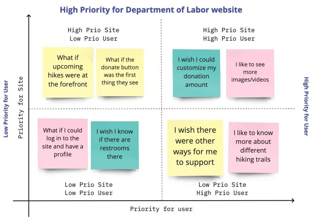
Though there were many user call outs to address in the redesign, we wanted to focus our efforts on tackling three main problems
Colors and overall feel of the website
Lack of information hierarchy
Little user control with donations - fixed amounts only
Information Architecture
Card Sorting
I am most proud of my group for our collaboration efforts in the information architecture process.
We were able to condense 7 unorganized sections into a simple 4 topic navigation.
Our design decisions:
Combine Event Calendar and OC Hikes & Forms into one section since the information was related. By doing this, the user has one place to go for hike suggestions and upcoming hike events
Create a Join Us tab that includes sign-up forms and an introduction to the OC Hiking Club team
Emphasize the Donate section and include the option to volunteer and buy merchandise in there rather than in the “OC Hikes & Forms” section where it currently resides
Improving the Donation Flow
I took responsibility for improving and redesigning the donation flow, by giving the user flexibility to choose their donation amount. Offering suggestions and the ability to customize provides control and satisfaction to the user. It is also beneficial to the organization as users will feel empowered rather than deterred by the process, resulting in a greater income of donations.
Sketches
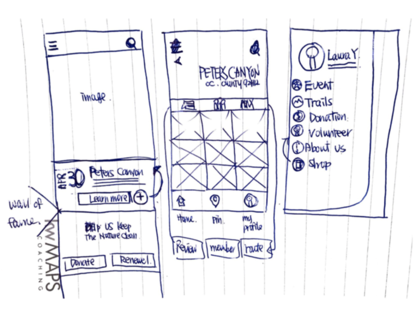
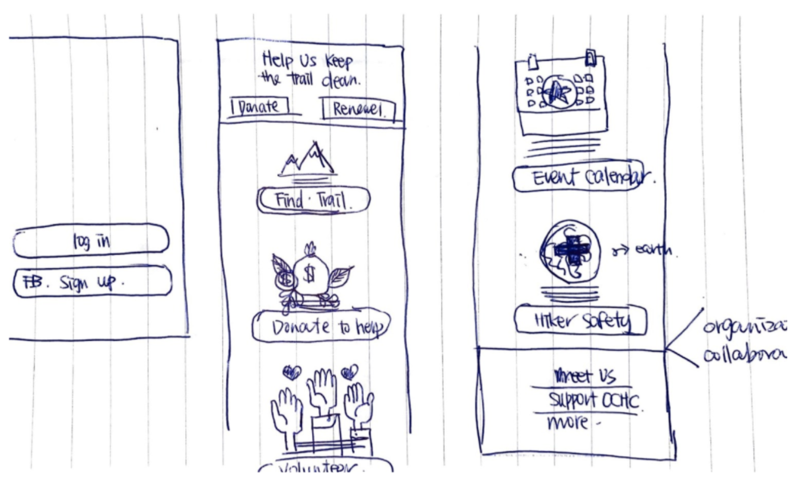
To ensure all ideas were seen and heard, each team member sketched out their vision of what the new design would look like.
We focused on the home and donation page when sketching as they were the most high-traffic areas that were in our redesign scope.
Lo-fi Wireframing
Taking the Doodle to the Next Level
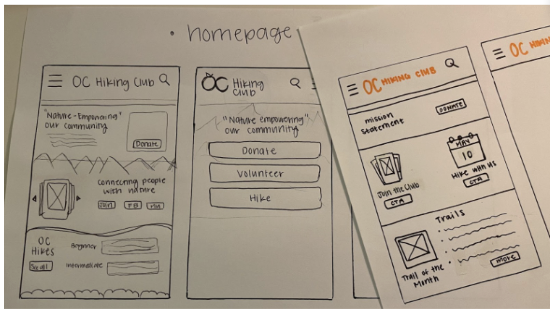
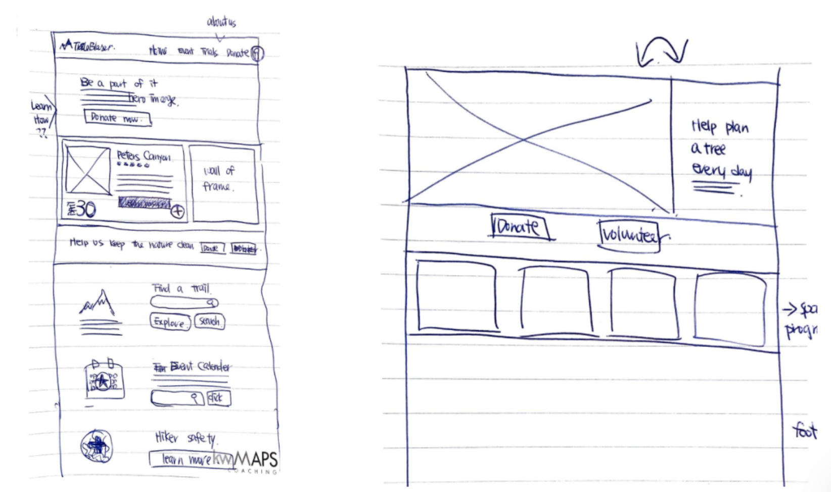
Using Invision, we developed some lo-fi wireframes for the homepage layout to help with content placement and structure
Responsive Web Design
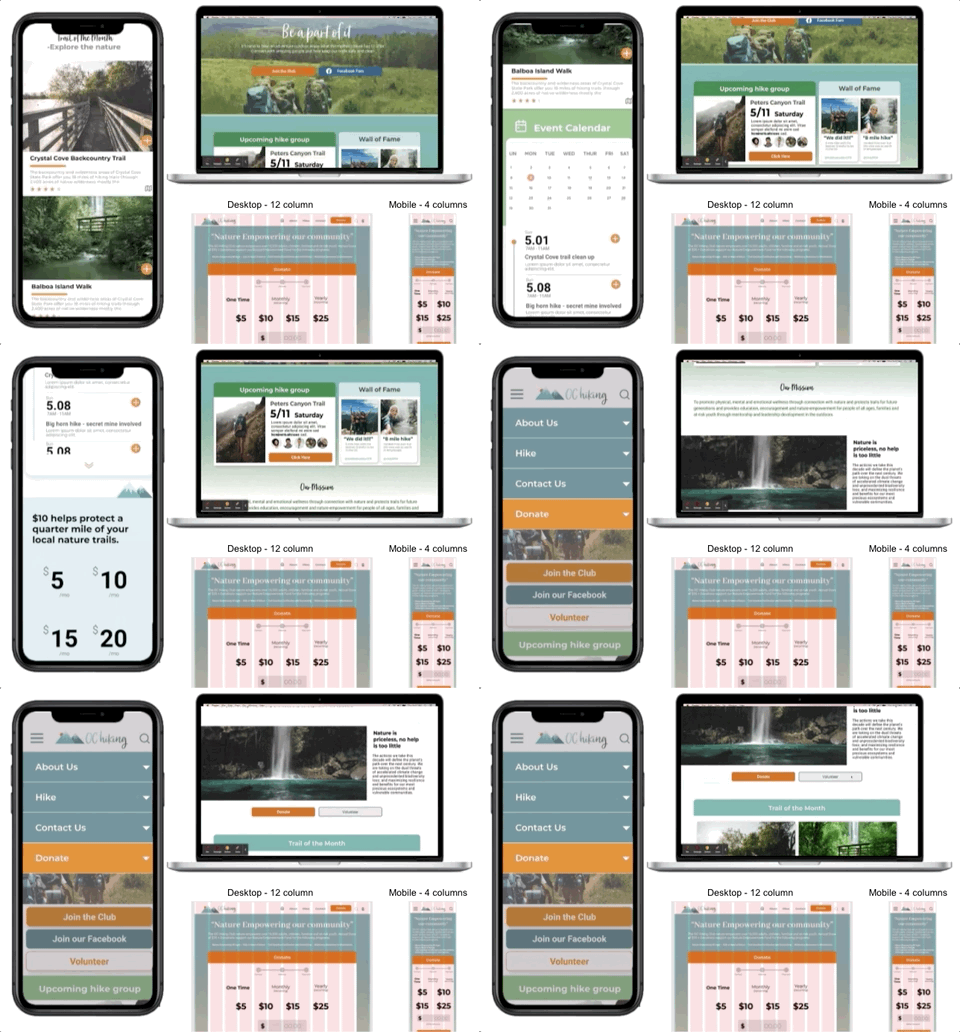
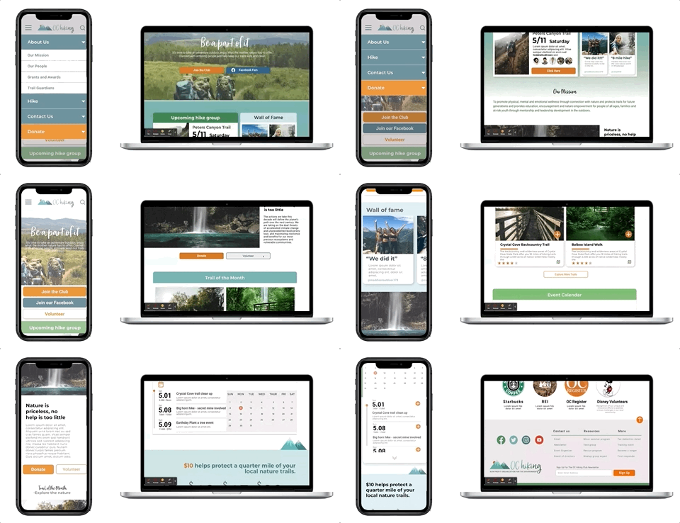
We followed a mobile-first design process and then moved up to the desktop layout.
With the help of auto-layout and designing on a column-grid system. For mobile we used a 4 column grid and for desktop we used a 12 column grid. We focused on responsive web design so that the user can access the site at home or while on a hike with any device!
Logo Redesign
OC Hiking club’s current logo is inconsistent across their social media, which can confuse the user.
So we took the liberty to unify all of that. Shout out to my team member, Laura Yang, who spearheaded the logo design.
Laura has a graphic design background and was a wonderful asset to our team! Once you’re done here, feel free to give her portfolio a visit too
UI Style Guide
Fresh & Inspiring
Progress
Throughout many stages of ideation and development, we kept on improving the site’s aesthetics and functionality.
Every step of the way we had our questions and concerns, but we were able to figure it out as a team and move on quickly.
The Reveal
Peer Feedback celebrated the successes of the redesign and also gave me some great insight on where to improve. My most common section for feedback was need for simple clean up, topics menu improvement, and revisiting the news section layout. So that is exactly what I did!
Animations
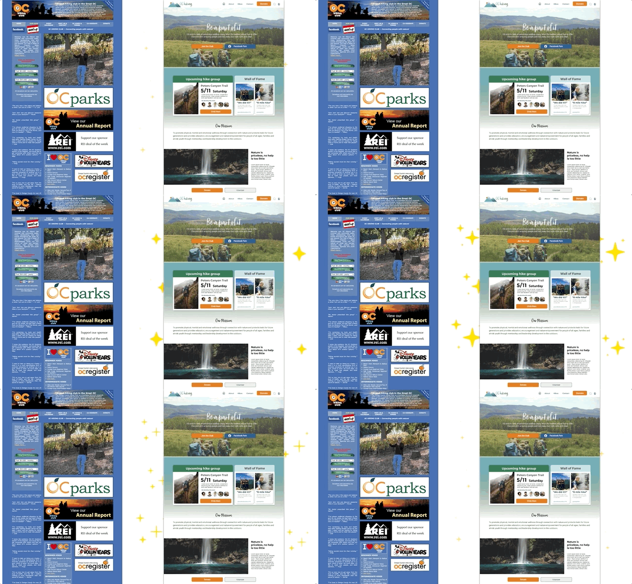
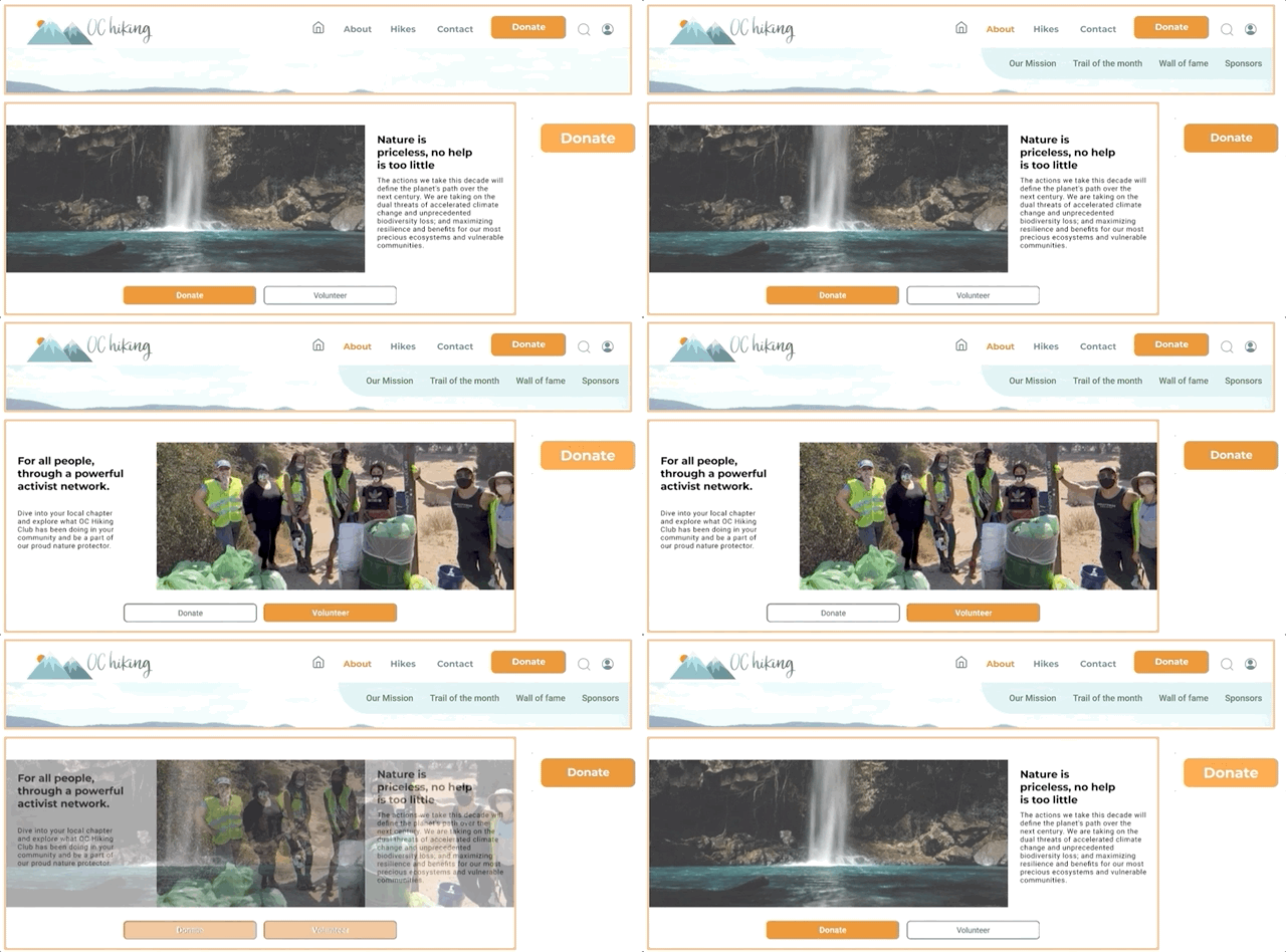
We added some animations to keep the user engaged
Hi-fi Testing
User Quotes
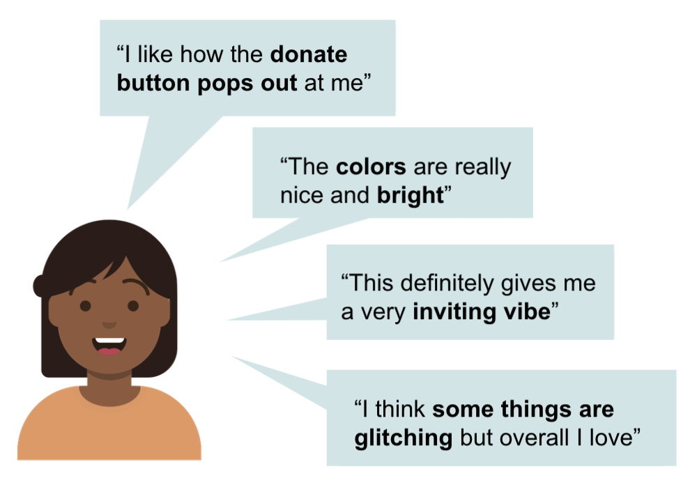
During the usability testing of our redesigned website, we got some positive feedback on the overall vibe and feel of the site.
There were of course some things that not up to users standards, thus they were not up to our standards. So we continued to iterate.
Iterations
Hero & Top Nav
From our usability test, we found that we needed to update the buttons on the home page to include Volunteer, since our users were having some difficulty finding it.
We took away dropdown menu from the donation button and made it into a direct button so that it is more intuitive.
Above the Fold
On the donate page and hikes page we found that users took some time to find the information that they were seeking since they needed to scroll around.
To bring ease to the user, we made iterations to both pages to ensure that all important info is above the fold.
Donation Process
Users were confused on whether the progress bar indicated what they have completed or where they are in the process. So we iterated and included a check mark for completion and a larger circle to show what page they are on.
We also included an email section for the user to easily receive a receipt for tax purposes.
Final Prototype
Key Takeaways & Next Steps
Takeaways
Working in a group is the best way to grow as a designer.
Listening to user needs, learning from teammates and leaning in to your strengths can create a beautiful experience for users
Next Steps
Continue to reach out to our stakeholders
Perform A/B testing on donation flow
Measure KPIs on donation amounts, comparing old and new version of the site
While you’re here…
-

RWD & IA Case Study
-

Mobile App Design


